On the ‘Style’ screen, there are a series of sub-tabs:
Dashboard
Button
Chart Panel
Chart
Table
Card
PDF
Login Screen
Config Screens
Mobile
Each of these options is covered in more detail in the Dashboard CSS Tags section. Prior knowledge of CSS and HTML is useful but not essential.
The Style can be found by clicking the ‘Themes’ option in Dashboard Configuration and then selecting a Theme on the left-hand side of the screen. Under the ‘Style’ tab there are a series of sub-tabs, Dashboard, Button, Chart Panel, Chart, Table, Card, PDF, Login Screen, Config Screens. Under each of these you will find the elements you are able to configure for that particular part of the dashboard.
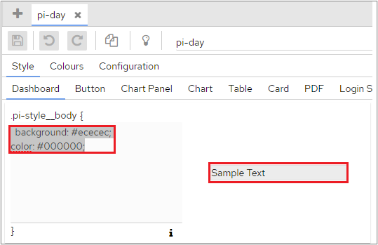
Each panel relates to one tag, ‘.pi-style_body’, the current values for that tag, outlined in the following screenshot and an example of the current setting, ‘Sample Text’.
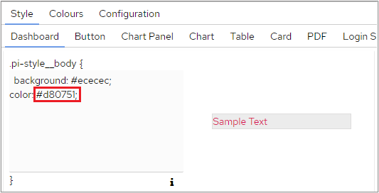
Changing the colour from #000000 to #d80751 for example changes the colour of the sample text.
Rather than using hex codes, you can also enter a new colour choice by typing the name of the colour e.g. red or blue.
To see how this change might look on the Dashboard, click the ‘Preview’ icon.
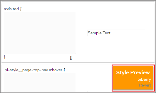
A ‘Revert’ button will also be displayed at the bottom right of the screen, which can be used to remove the preview of the changes.
If the change you made only affects the dashboard, you can click ‘Back To Dashboard’ at the top right of the screen to see the effect of your change(s) on the whole Dashboard. The ‘Style Preview’ option will remain in-situ at the bottom right of the dashboard, which is especially useful if the change you have made means you can no longer easily access the Themes screen!
Save your changes by clicking the ‘Save’ icon in the upper left-hand corner.
Colours
This section globally defines the colour palette used by the dashboard. Charts will pick from these colours when they render, unless you have manually specified different colours on the chart or on the dimension configuration.
A chart that needs three colours will pick the first three colours you have defined on this page.
If you have defined ten colours but your chart needs eleven, then the first colour on this screen will be utilised twice. It therefore makes sense to ensure that you have a reasonably large number of colours specified, and that they are sufficiently different from each other that values can be correctly isolated in charts.
To define a new colour
Click the ‘Add’ icon on the right-hand side of the screen.
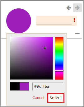
A new colour example will be displayed next to the existing colours. Click the circle to open the colour palette.
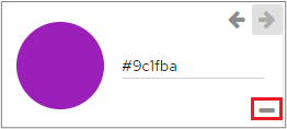
Choose the colour that you want to use and click the ‘Select’ button. As in the other colour options, the Hex key has been added in the name field. You can add anything you want here.
Remember to click the ‘Save’ icon to confirm your changes.
To delete a colour
Click the ‘Remove’ icon next to the relevant colour.
Configuration
This section allows users to define additional aspects associated with the stylistic parts of the dashboard, over and above the CSS tags.
Dashboard
Always Show Logo – When ticked, this will force the logo to always be displayed on the category. Un-ticking it will hide the logo when the category list isn’t displayed.
Dashboard Logo - the logo used inside the dashboard, as shown in the screenshot above. The image needs to be located in:
…\tomcat\webapps\panMISDashboardResources\themes\<<YOUR_STYLE_NAME>>\img
PDF Logo - the logo file that will be used when a PDF is generated. The image needs to be located in:
…\tomcat\webapps\panMISDashboardResources\themes\<<YOUR_STYLE_NAME>>\img
Loading Icon – the icon that is displayed when a category is loading.
…\tomcat\webapps\panMISDashboardResources\themes\<<YOUR_STYLE_NAME>>\img
The optimum size for a logo is around 100px X 50px.
Fonts
Custom Font URLs This allows you to configure Custom Fonts to be utilised in piDashboard. The URL specified needs to contain the @Font_Face rules, for example: https://fonts.googleapis.com/css2?family=Balsamiq+Sans&display=swap ).
To add a font, click the ‘Add’ icon and enter the font details.
You could then use .pi-style__body with font-family: 'Red Hat Text' to apply to everywhere in the dashboard.
Charts
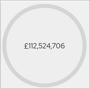
Lightbulb Chart Border Display - when ticked; a border will be displayed around the edge of a light bulb chart type.
Example
This shows how a lightbulb looks with a border.
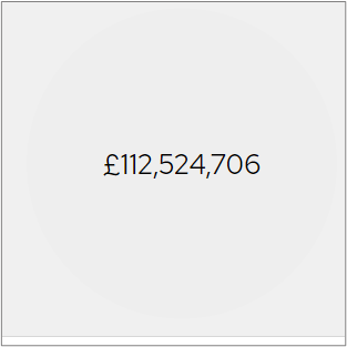
Example
This shows how a lightbulb looks without a border.
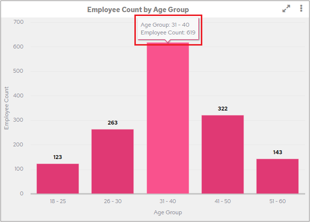
Turn Off Tooltips – if this box is ticked, tooltips will not be displayed when you hover charts. The following screenshot shows how tooltips are displayed.
Show Line Dots - this is used to show line dots on Spline and Line charts. By default, this option is not selected.
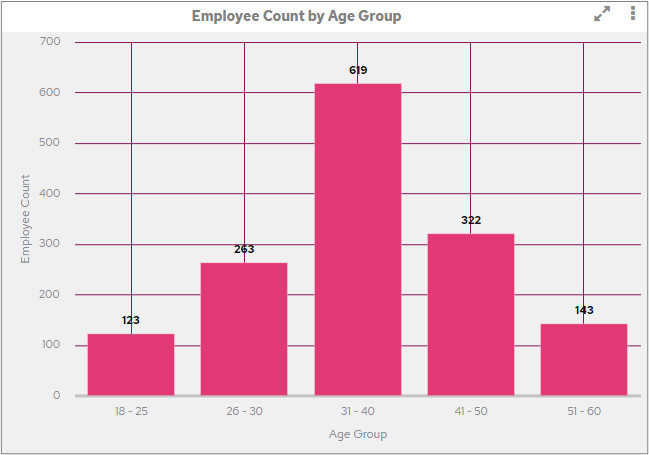
Chart Grid Line Colour. – this is used to set the colour of the gridlines used in a chart. To specify a colour, enter a HEX code into this field.
Example
This example shows how the grid lines will look on a chart.
If a colour is not entered here, the standard dashboard grid colours will be used. Certain named colours can also be used, please see https://www.w3schools.com/cssref/css_colors.asp for more information.
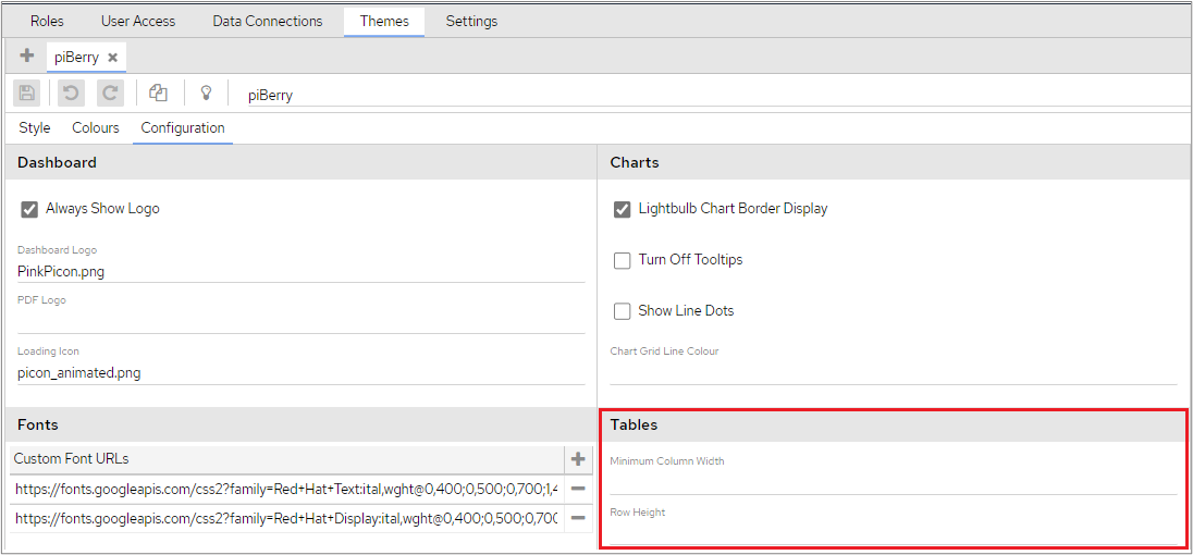
Tables
Adding a numerical value to ‘Minimum Column Width’ field will restrict all table columns so that they don’t fall below the specified width. This value will be respected even if width values have been applied to individual columns in the Edit Chart screen.
Adding a numerical value to ‘Row Height’ will fix the height of all table body rows to the specified height. Setting this value will also overwrite line-height in .pi-style__table-body-cell, to use this property the !important tag needs to be added to line-height in .pi-style__table-body-cell.
Row height does not apply to header rows, which can already be adjusted in the tables styles tab with .pi-style__table-header-cell using the line-height property.
Login Page
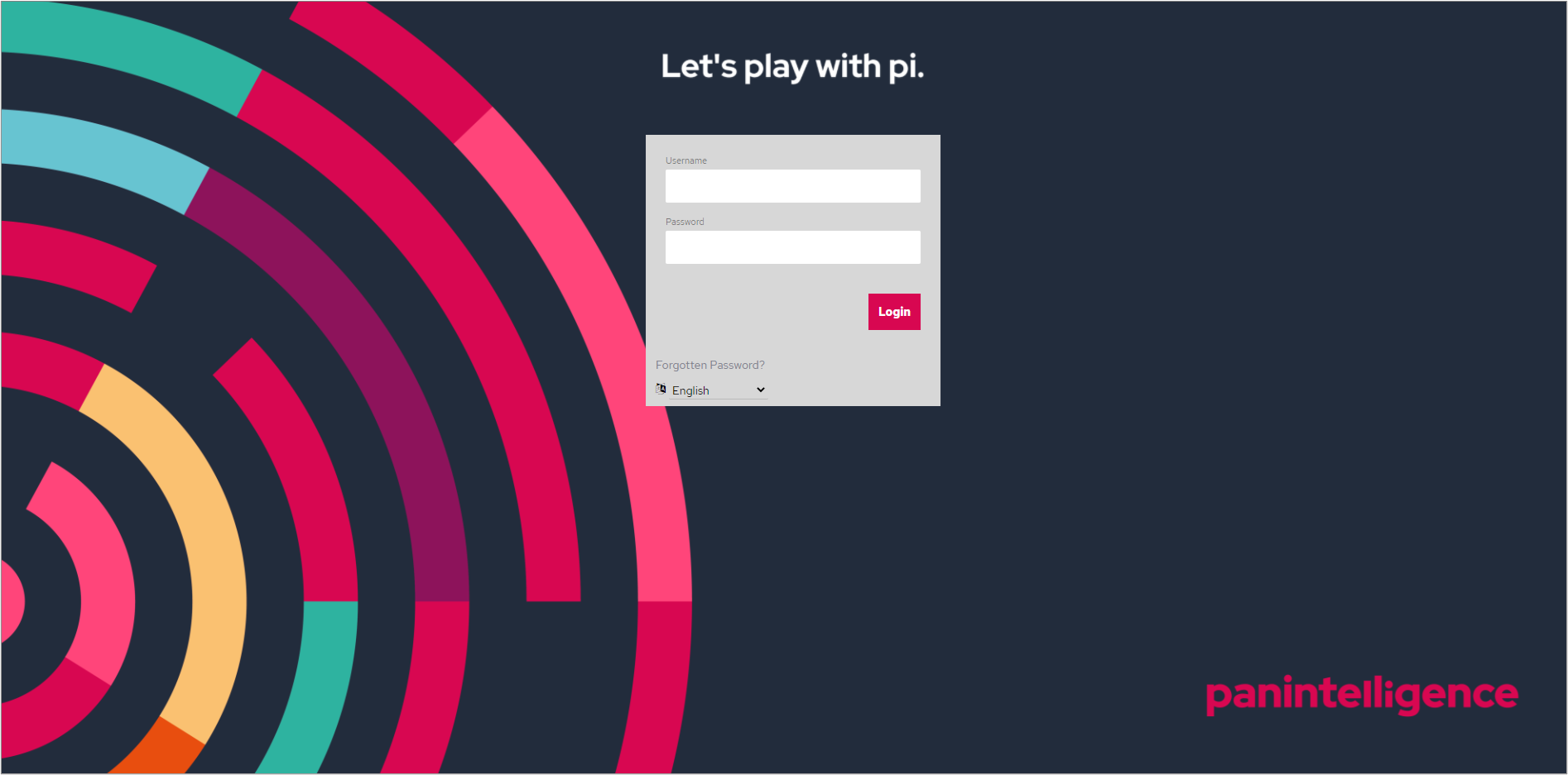
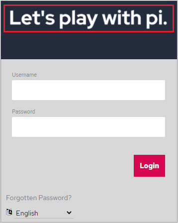
Login Screen Background Image - the background ‘splash’ screen is displayed when the login window is presented. This field supports the same image types as Login Screen Logo.
Login Screen Logo. The image used on the login screen. The image needs to be located in:
…\tomcat\webapps\panMISDashboardResources\themes\<<YOUR_STYLE_NAME>>\img
The image appears here on the logon screen:
The following image types are supported:
PNG
JPG
BMP
GIF
Other Styling Not Covered Elsewhere
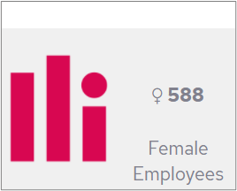
Images in Card chart types. You can embed an image inside a card chart by using the Image box on a card. Tick the ‘Image’ box and enter the name of the image into the Image field in Content section on the right-hand side of the screen.
Example
This is how the image will appear when used on a Card chart type.
The images need to be placed in this folder: …\tomcat\webapps\panMISDashboardResources\images
Using ‘Font Awesome’ Icons in Cards / Tables
This process allows you to use images alongside text in tables and cards chart types.
To search for an icon, try https://fontawesome.com/v4.7.0/icons/
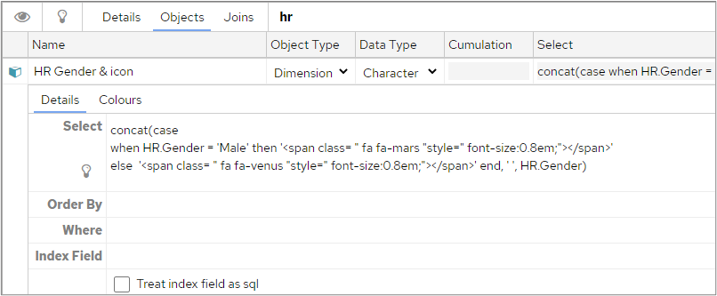
The HTML required to display an icon is:
<span class= "THE NAME OF THE FONT ICON"style="color:#ffffff; font-size:0.8em;"></span>
Example
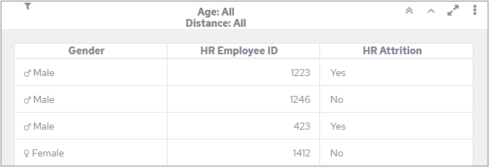
In the following example an image has been concatenated with the Gender object.
When this is used in a table, the image and the gender will appear together in the same column.
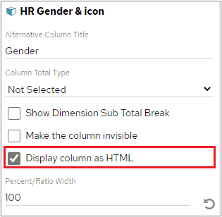
You will also need to ensure that you tick the ‘Display column as HTML’ on the Attributes tab for the relevant column.
Logos in reports
If you want to use a logo in a report, it must be placed in the following folder: …\Dashboard\tomcat\webapps\panMISDashboardResources\images
You will only be able to use Reports if you have purchased the pi Reports module, please speak to your Customer Success Manager if you wish to purchase this.
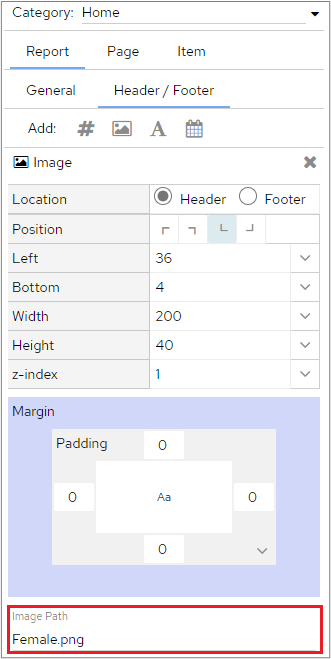
The image can then be added to the report by choosing the Image icon in the Header/ Footer section of the report and typing the name of the image into the Image Path field.
Making the dashboard vertically larger
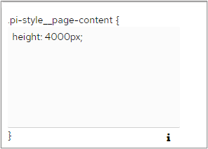
Add the property “height: 4000px;” to the .pi-style__page-content class. This class can be found on the ‘Settings’ tab in Dashboard Configuration. Please refer to the section on Dashboard CSS Tags for more information.
This will extend the height of the “page” allowing you to scroll up/down the dashboard, rather than the vertical size being decided by the monitor.










Add Comment