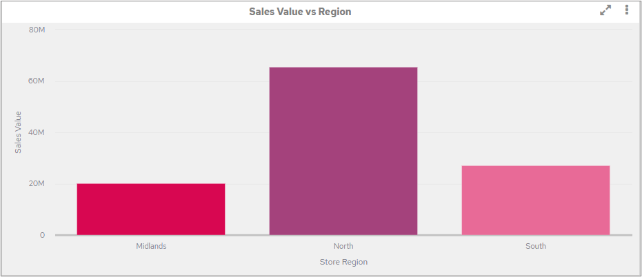
By default, the chart segments will be coloured based on the colours created in the theme(s). The first chart segment will have the first colour, the second the second colour etc. For much of the time this is fine.
You can also manually, on a chart-by-chart basis, change the colours to be used for different objects on the Attributes screen; for example, to display a certain Division of an organisation in a particular colour.
There may be certain objects however where you always want certain values to appear in fixed colours. The two main reasons for this are:
Within the organisation there is already a colour association.
You want charts to be consistent. For example, if you had two charts side-by-side; one showing Sales Value by Product Group (or Department or Salesman etc.) and the other showing Sales Quantity by Product Group it would be potentially confusing / misleading if the same Product Group was different colours on each chart.
Therefore, on a Dimension object it is possible to assign colours to values. To do so click on the ‘Colours’ tab for a given Dimension object and any existing rules will be shown, to create a new rule, click the icon on the right-hand side of the screen.

Click the down-arrow next to ‘Please Select’ ….

A list of the values in this object will be displayed.

Click on a value to select it, you will then be returned to the original screen where you can select a colour to be used for the selected value. To choose a colour, click on a colour in the palette and then click back on the main screen to apply the colour.

Repeat this process if you want to set different colours for each of the values.

Each of the values shown will now display in any charts or tables that are created using this data object, unless it is specifically overridden, on an individual chart on the Attributes screen.
Remember to click the Save icon to confirm the changes. |

Example
The following screenshot shows how the colours applied to the values in the instructions above would appear when this object is used in a chart.
