
We are pleased to present our latest offering of pi - our January 2022 release! This page helps summarise and familiarise you with the changes we have made, and is supported (where applicable) with useful videos to help explain the changes we have delivered.
| Info |
|---|
Before upgrading, we recommend taking a backup. You can find more information here. |
| Info |
|---|
We are aware of an issue with the January release when using an external database for the dashboard configuration where the schema isn’t called ‘dashboard’. |
Here’s what we’ll cover;
| Table of Contents | ||||
|---|---|---|---|---|
|
Added
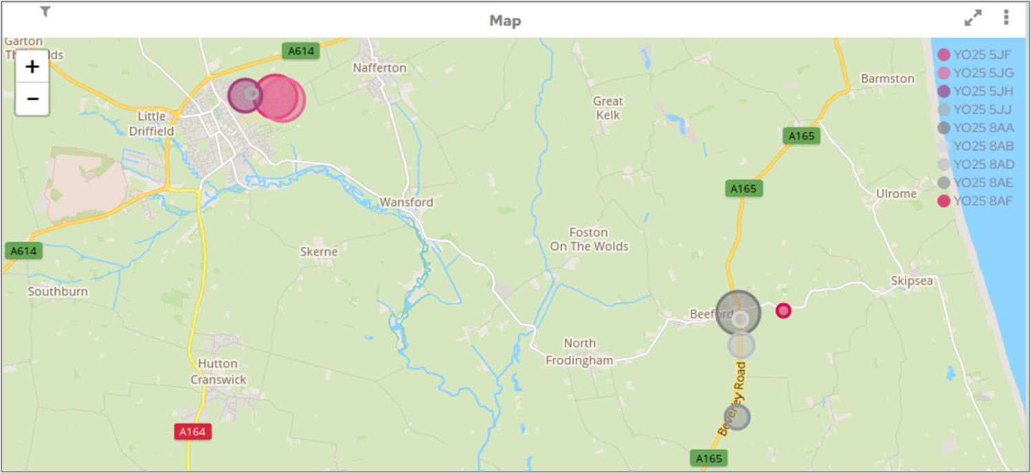
Multi-dimensional maps are now available on the map chart type. To add a legend to your map, add the relevant dimension to the legend field on the Data tab.
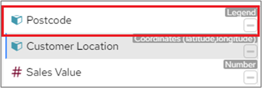
Similar to multi-dimensional charts, the legend will appear on the side of the map and colours of the data points changed accordingly.
Please refer to this section in pi Documentation for more information.
The deployment project now has an empty custom_jdbc_drivers folder on Linux for customers to use, this also fixes an issue with tomcat not configuring properly when the file was missing.
We now ship the Athena JDBC driver so an Athena data connection can be created rather than having to set this up via the Freeform JDBC.
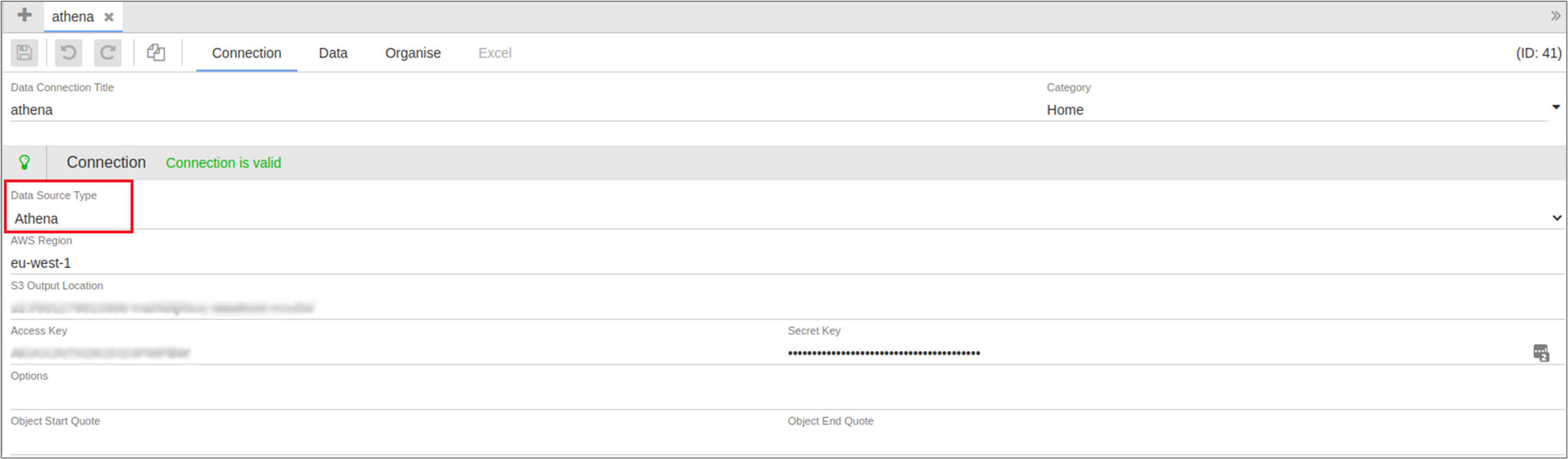
To create an Athena connection, select Athena from the data source type. You will need to specify the AWS Region, S3 Output Location (the s3 location where you want to store the query results), Access Key and Secret Key.
You can also add Options which must be in the format [Property1]=[Value1];[Property2]=[Value2].
The Chart Editor screen has been updated and will now display errors in the preview area if the chart has errors. This information will only be displayed to users who have the ‘Can View Chart Debugging Info’ permission.
Date Range type category objects can now provide text replacement to separate the From Date and the To Date.
For example,
if a user selects 01/01/2022 and 03/01/2022 from a date range category object
the chart in this category has a title with ‘From {{Sales Date[0]}} to {{Sales Date[1]}}’
this chart title is converted into ‘From 01/01/2022 to 03/01/2022’
When any of the following chart types are created, ‘Show Data Values’ on the Attributes screen will be selected as default:
Chord Diagram
Horizontal Sankey
Vertical Sankey
Network Graph
Pie
Doughnut
Pie Variable Radius
Doughnut Variable Radius
Sunburst
Doughnut Sunburst
Traffic Light
Lightbulb
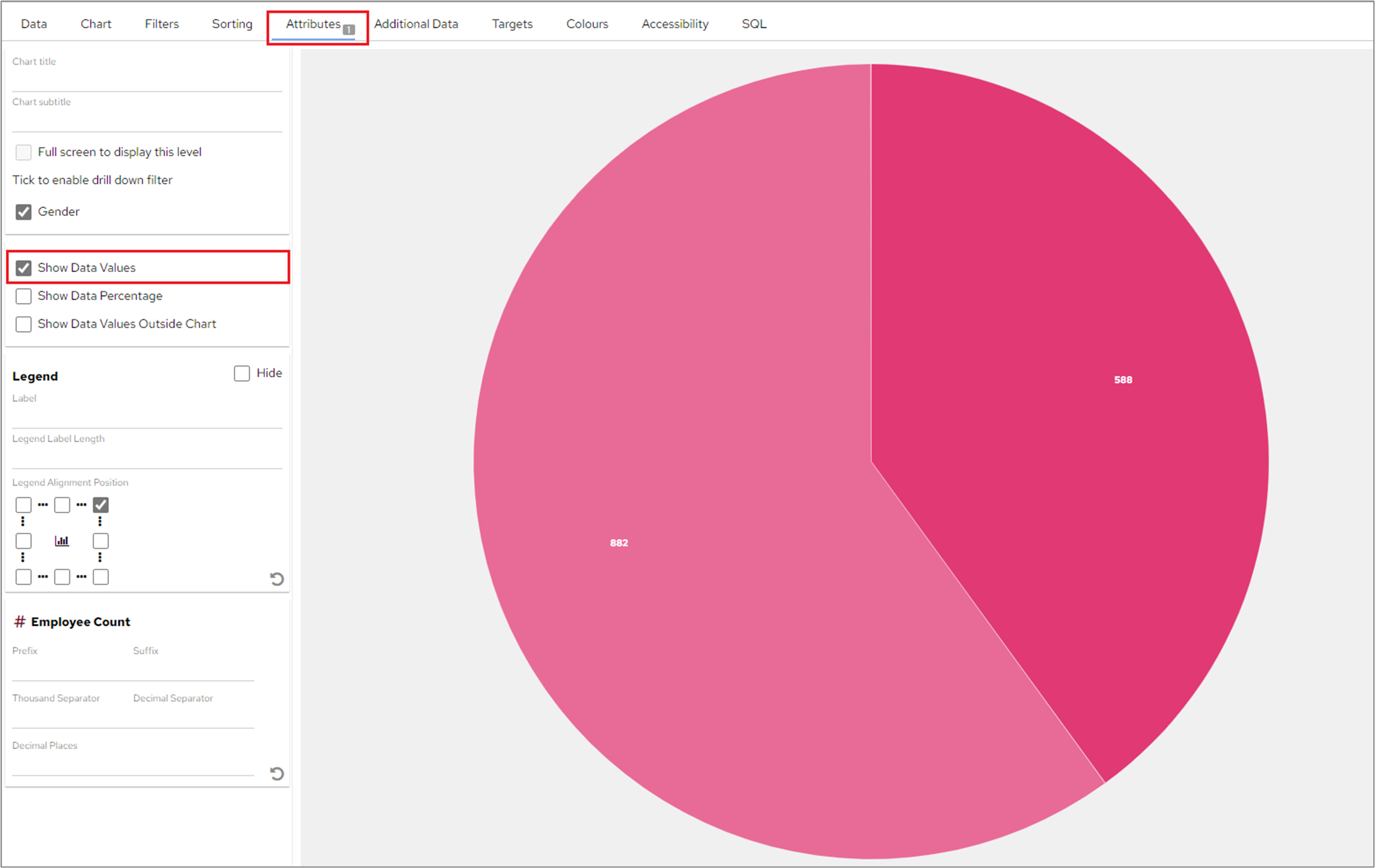
If required, users can still deselect this option on the Attributes screen.
| Info |
|---|
If a user changes from one of the above mentioned charts to a chart not included in this list for example, switching from a Pie chart to a Bar chart the ‘Show Data Values’ label will be deselected but this can be added on the Attributes screen if required. |
Changed
When users swap the order of the Y Axis items on the Data screen for a Combined Chart this will be reflected correctly in the chart. In the following example, the ‘Employee Count’ measure is displayed first in the list of Measures on the Data screen and on the left-hand Y Axis of the chart.
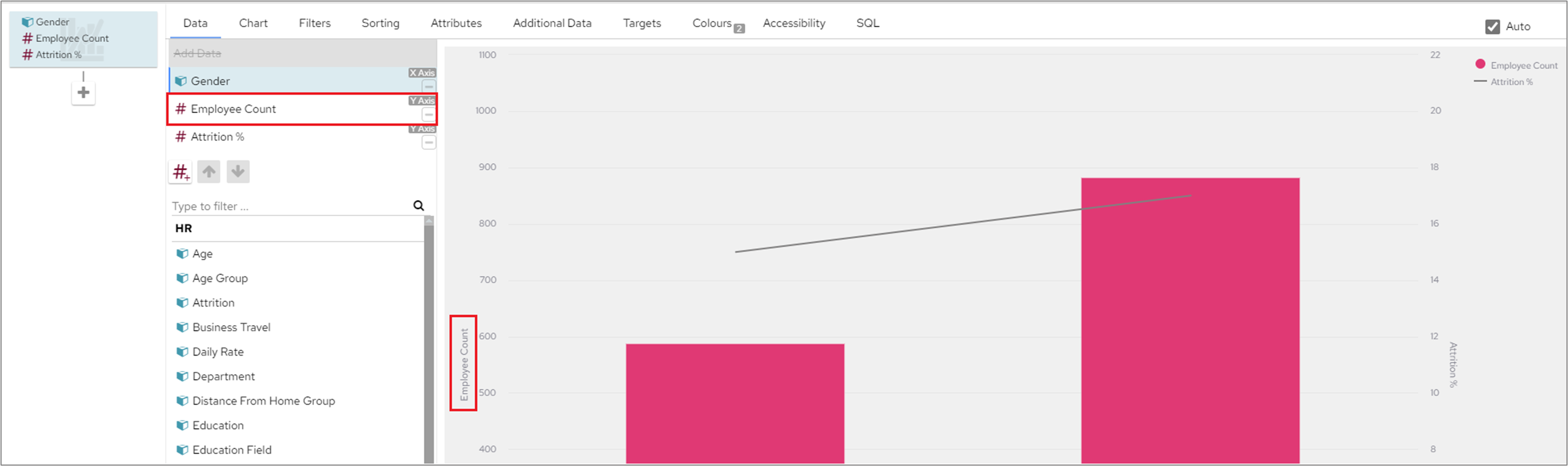
When the order of the Measures is changed on the Data screen, the relevant Y Axis will be updated accordingly.
Several library upgrades have been included to ensure customers benefit from the latest security fixes
Additional attributes have been added to a Docker container health check functionality and the number of checks that are being carried out in order to improve the assessment of the state & health of the container have been increased.
Tomcat has been updated to 8.5.73 to resolve a recently discovered vulnerability in Tomcat.
When HTTPS is turned on, you might need to configure the dashboard URL so that other services (such as Scheduler, Renderer etc) know the correct way to reach the dashboard.
| Note |
|---|
If you attempt to upgrade to this version without updating the configuration below prior to use, you could find that your schedules, exports and reports may no longer operate |
This is especially true when a non public certificate is used.
You can configure the dashboard URL (e.g. https://your.dashboard.com/pi) in 3 ways (see below):
| Info |
|---|
Note that |
The Dashboard URL setting in the configuration tool
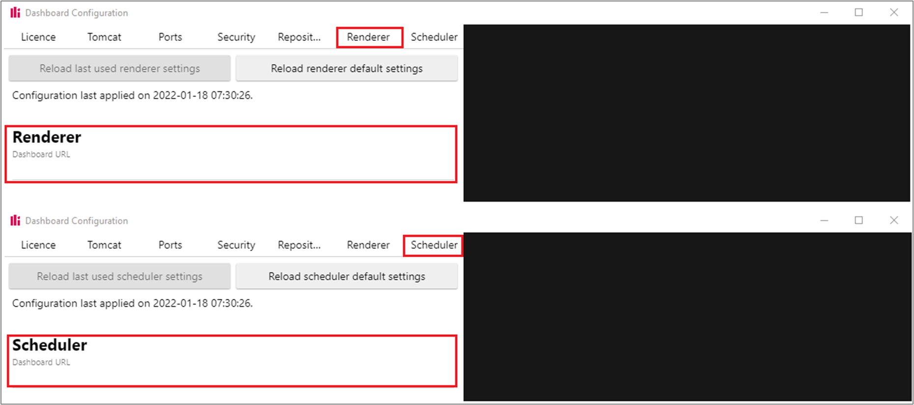
The dashboard.json configuration file
Edit "dashboardUrl" in dashboard.json for the "renderer" and the "scheduler" items:
| Code Block |
|---|
    {
        //...
        "renderer": {
            //...
            "dashboardUrl": "https://your.dashboard.com/pi",
            //...
        },
        "scheduler": {
            //...
            "dashboardUrl": "https://your.dashboard.com/pi"
        },
        //...
} |
The environment variables
If you’re using a docker environment or an AMI, you will want to add the following environment variables:
RENDERER_DASHBOARD_URL="https://your.dashboard.com/pi"SCHEDULER_DASHBOARD_URL="https://your.dashboard.com/pi"
The IDs on the human muscle map svg images have been updated to something that makes a bit more sense. See tables below.
For human-muscles-front.svg:
Old ID | New ID |
|---|---|
|
|
|
|
|
|
|
|
|
|
|
|
|
|
|
|
|
|
|
|
|
|
|
|
|
|
|
|
|
|
|
|
|
|
|
|
|
|
|
|
|
|
|
|
|
|
|
|
|
|
|
|
|
|
|
|
|
|
|
|
|
|
|
|
|
|
For human-muscles-back.svg:
Old ID | New ID |
|---|---|
|
|
|
|
|
|
|
|
|
|
|
|
|
|
|
|
|
|
|
|
|
|
|
|
|
|
|
|
|
|
|
|
|
|
|
|
|
|
|
|
|
|
|
|
|
|
|
|
|
|
|
|
|
|
|
|
|
|
|
|
|
|
|
|
|
|
|
|
|
|
Fixed
When users had the Category list, on the left-hand side of the screen, pinned in place and used the ‘Peek’ button in the Chart Editor screen the screen would occasionally flicker.
When using category objects to replace text using the {{Object Name}} syntax, and the text contained a single quote, the quote was converted into 4 single quotes (incorrect sql escaping) for SQL generation. This resulted in no data being returned. Now only 2 single quotes are used to escape a single quote in SQL
When a users password was reset by an Administrator and the ‘Password Expires’ box was ticked, the user would be asked to select a new password but would be able to use the same password set by the administrator. The password entered by the administrator will now become part of the users password history, preventing them from reusing the same password.
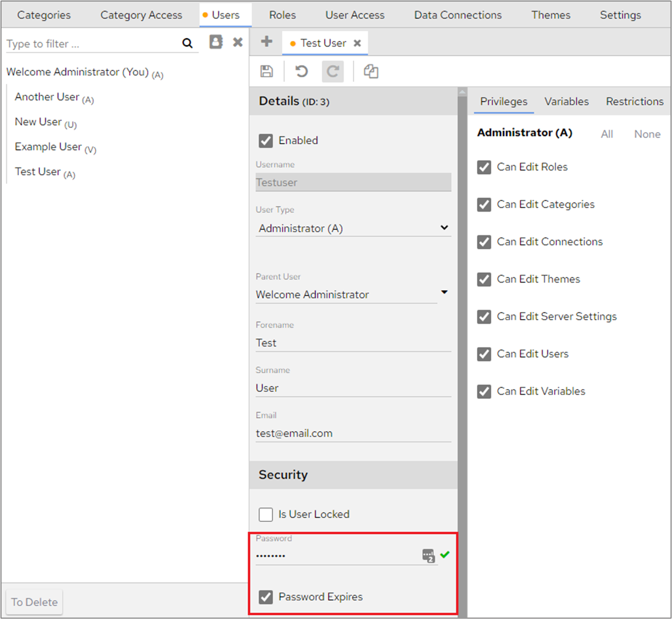
| Info |
|---|
Administrators will still be able to use the same password multiple times when resetting users passwords, this password will be added to each individual user’s password history. |
When downloading PDFs:
The File path has been corrected so that internal image files can be used as the logo when downloading a PDF of a chart
It also recognises and works with external internet URLs
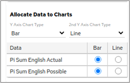
Previously, if a user created a combined chart and assigned both Y axis to use the same Y axis in the ‘Attributes’ section for example, both set as Bar, the chart would draw an unnecessary line with 0 value through the centre of the chart to display the Y axis which was empty. A change has been made that will ensure that if a user chooses to assign both Y axis to the same axis the data is displayed correctly with no zero value being shown.
In this example, both Y Axis have been set as Bar.
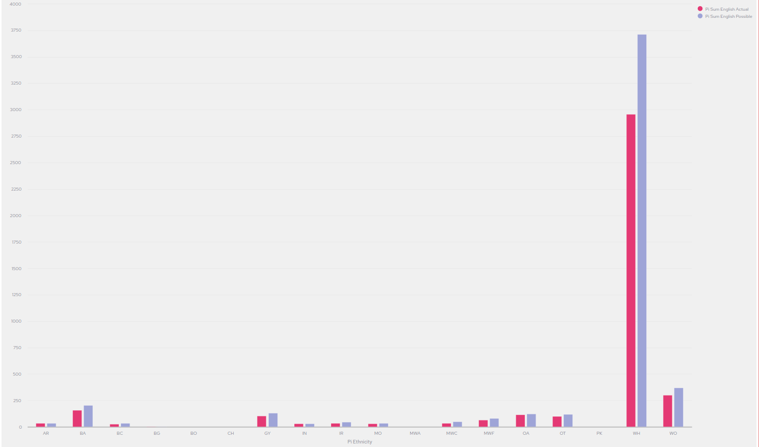
The data in the chart is displayed correctly.
When using the ‘Pagination’ setting in Chart Editor, the table displayed in the Preview section will be updated to reflect the chosen setting.
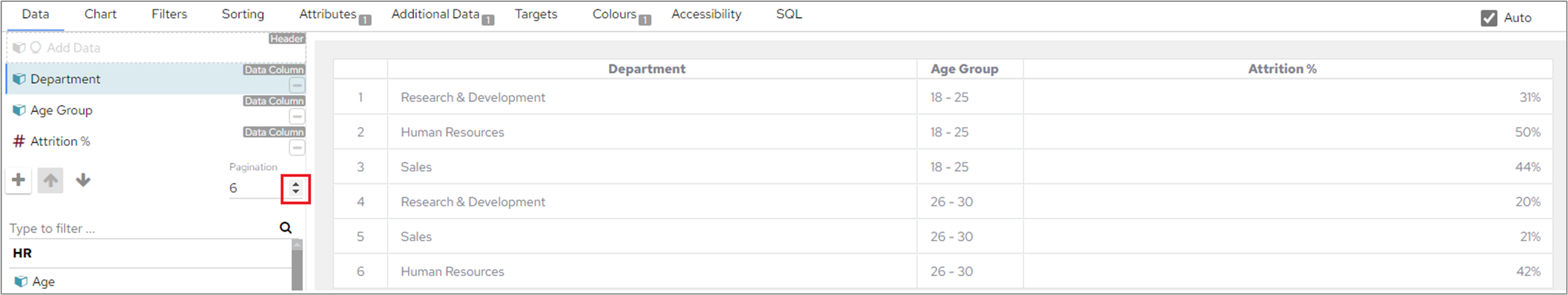
For example, if 6 is selected in the ‘Pagination’ field the table preview will show 6 rows. If the ‘Pagination’ number is changed to 10, the table in the preview section will also be updated to show 10 rows.
When displaying the scheduling screen in a small browser window, everything was overlapping. The screen now creates a horizontal scroll bar so that content is displayed correctly.
Maps (and Heatmaps) without data will now display a ‘No Data’ message rather than displaying with blank content.
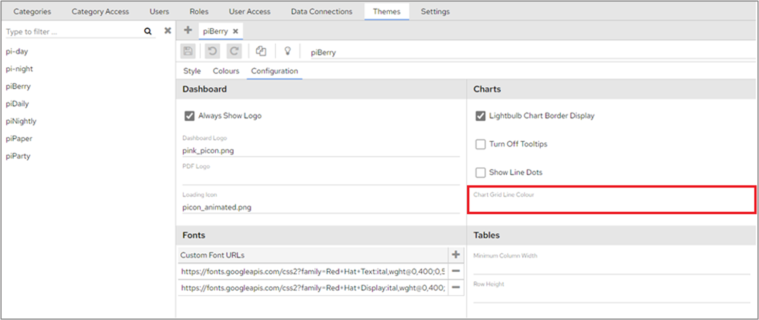
The Grid Line Color option under Dashboard Configuration>Themes>Configuration didn’t work for the 'X' axis on web charts (spider, radar, wind rose) or merged and combined charts. If a grid line color is specified, it will now work as intended across all chart types.
Text & number formatting has been updated so that when adding a prefix to a negative value in a measure the prefix will appear after the minus sign (or the opening bracket if you have chosen to show brackets for negative values in a table). Values will now be displayed as -£50 or (£50).
Clicking on an active drill level hierarchy in the chart editor screen would occasionally cause problems when the system tried to redraw the chart, this no longer happens.
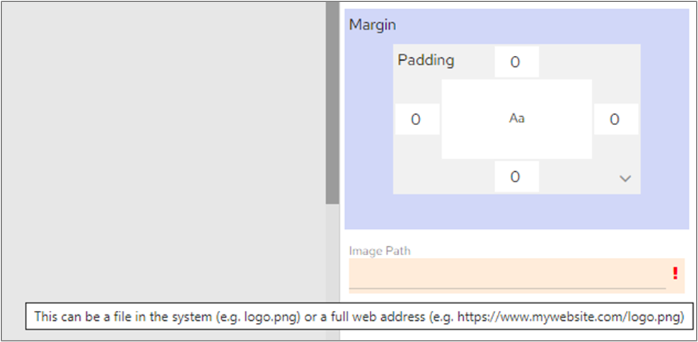
The Report, Header image section has been updated to show help text and indicate any errors when unsupported image paths have been used. When users hover over the Image Path field, help text will now be displayed.
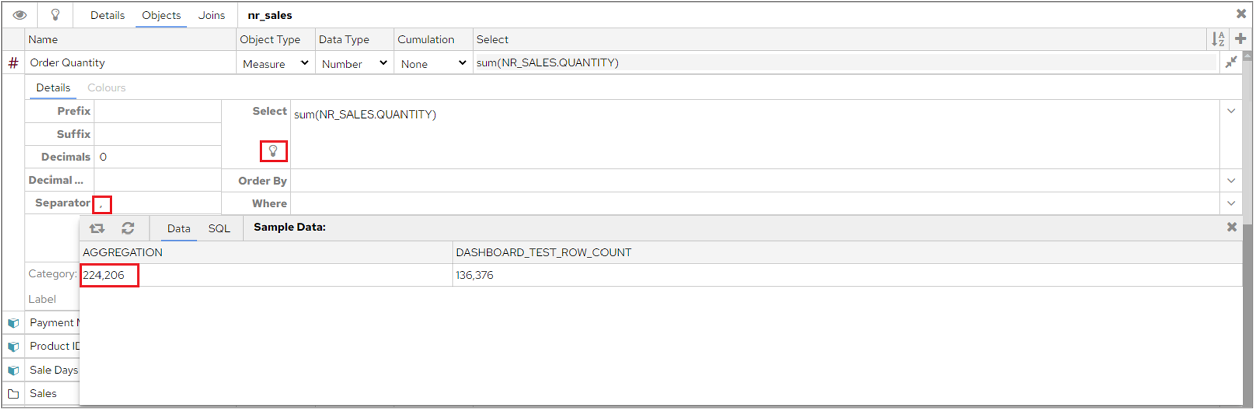
If you’ve added formatting options, such as a thousand separator, prefix or suffix, to a data object in Data Connections the relevant formatting will be displayed when you test the object using the ‘Display Sample data’ icon.
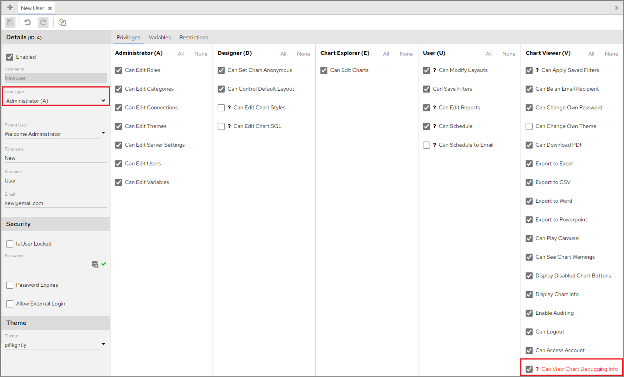
When changing a standard user to an admin user, the ‘Can View Chart Debugging Info’ privilege will be automatically selected.
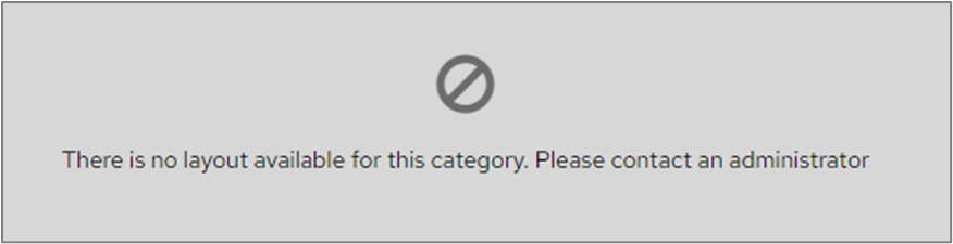
When a user, who doesn’t have the ‘Can Modify Layouts’ privilege, views a Category that doesn’t have a default layout they will see the following error message.
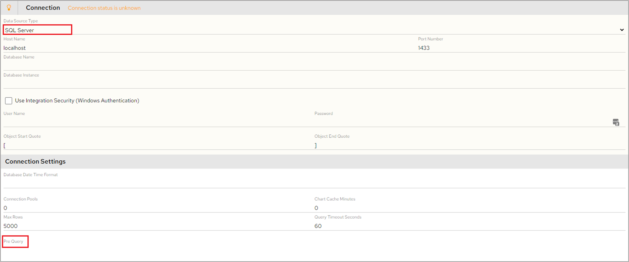
In Data Connections>Connection, the Pre Query input field is now only available for SQL Server and Free Format jdbc connections.
If a table had been created that used Pagination and the table was then changed to a Bar Chart the pagination values were being retained and the chart was only displaying the number of bars that matched the pagination setting. For example, if you set pagination to 2 on a table and then converted the table to a Bar Chart only 2 bars would be displayed in the Chart Editor screen. This no longer happens and the Bar Chart will now show all values in Chart Editor when converted from a table with pagination.
When using Chrome, a horizontal scroll bar will no longer be displayed on tables when not needed.
When using stacked column and stacked bar charts that had ‘Show Data Values’ selected on the Attributes tab and a Target Line had been added, the data values were occasionally being hidden. This no longer happens and all data values will now be displayed when a target line has been added.
When filtering a chart by selecting one or more items from the legend, the target line now remains in place. In addition, when clicking back to display the full list of legend items the chart is resized correctly.
Previously charts that draws dots would show nothing when there was only one value available on the chart, users would have to hover the mouse on the chart to see the single value. A change has been made to ensure that a dot is displayed when charts only have one value. This affects the following chart types:
area chart
stacked area chart
percentage stacked area chart
spline area chart
step area chart
line chart
spline chart
step line chart
spider chart
radar chart
combined chart with line or area
If the password of the data connection to be exported contains variables, the password with the variable is now included in the data connection export.
If the import connection password doesn’t have variables, after exporting and importing to a target system, it won’t force the target system to change the connection password. Instead, it instructs the target system to maintain the password (because the exported file has an indicator to indicate maintaining the password).
Previously the connection password was not exported, so after importing such a connection, users needed to re-configure the connection password regardless of whether it contained variables or not.
| Info |
|---|
The connection will not be exported with the password being clear text in the json file. |
Errors will now be shown, if they exist, on Merged Charts and Merged Tables, even when the error relates to one of the child charts/ tables.
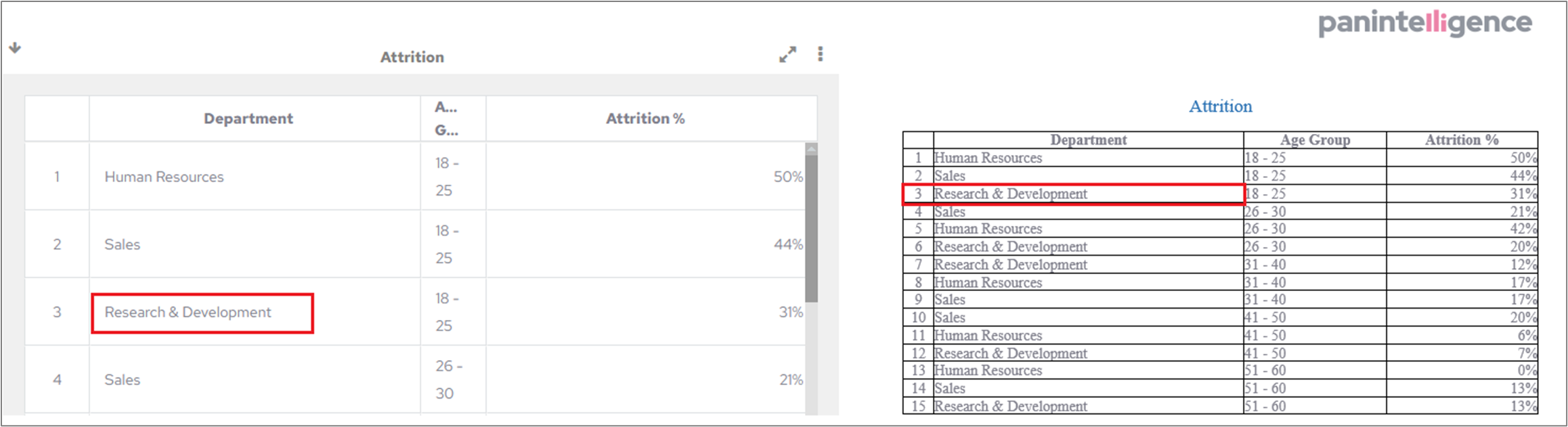
Previously, when using numeric dimensions as a Node or State for a Sankey chart, the data was not organised correctly.
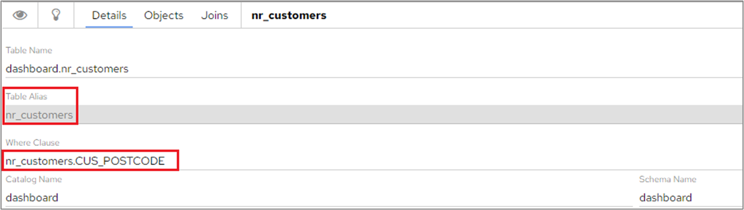
When selecting a column for the WHERE clause on a data table, the table alias will now automatically be added to the WHERE clause field.
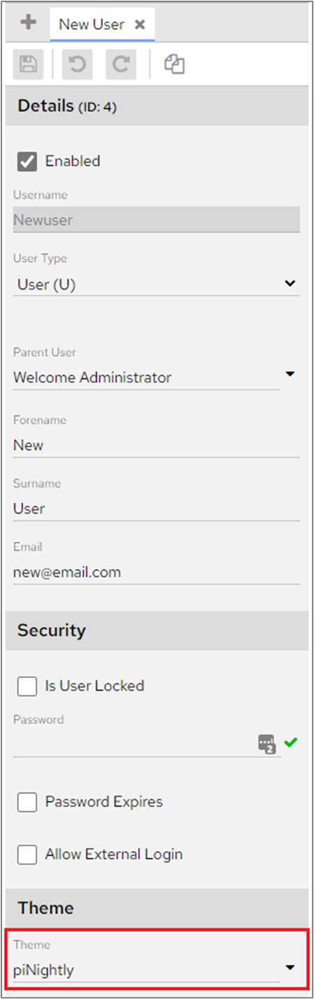
If an Admin user changed a users theme on Dashboard Configuration>Users for users that had the permission ‘Can Change Own Theme’ disabled, the theme reverted back to the default theme used for new users when the ‘Save’ icon was clicked. This no longer happens and Admin users can change and save themes successfully.
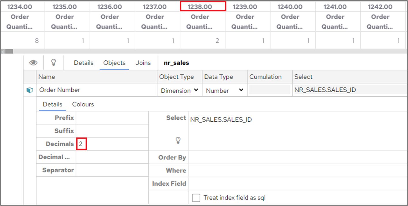
When formatting options had been specified for a number dimension for example, changing to 2 decimal places, the formatting options were not being applied when the number dimension was used as a Crosstab header. This no longer happens and any formatting options will be reflected correctly in the header field.
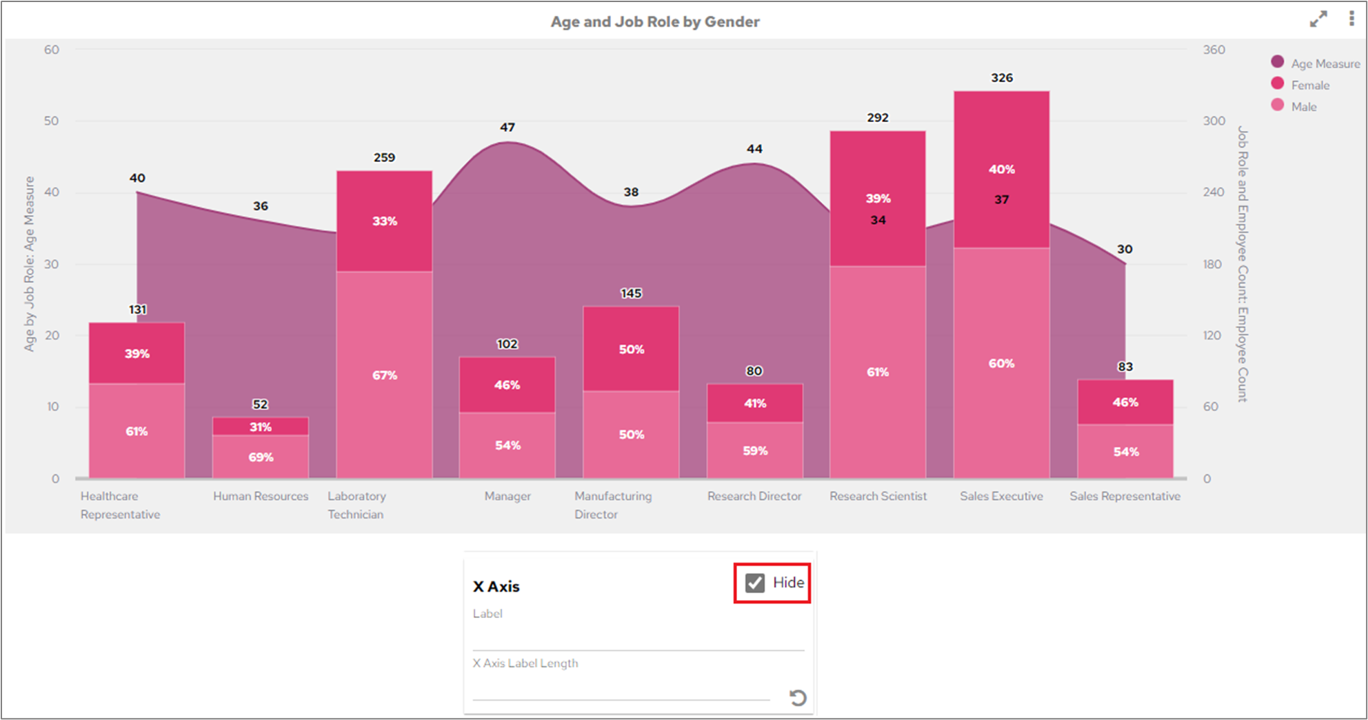
When X Axis attributes were added to a Merged Chart for example, hiding the X Axis, changing the label or label lengths they were displayed correctly in Chart Editor but were not shown when the chart was saved and viewed on the dashboard. Any X Axis attributes that are added to Merged Charts will now be saved and applied correctly.
Users cannot use the PUT /users API endpoint to update their own details. The reason it’s not allowed is because this endpoint allows editing user permissions, and the system should not allow a user to give themselves more permissions.
The following changes have been made to the API:
a new api endpoint /userAccounts/self is available for anything editable by the user themselves
the /users endpoint now explains that only super admin can change themselves, and it refers to the other endpoint for updating a user’s own details
Please refer to the new version of the API documentation for further details.
Occasionally, when assigning a new role to a user an error message was being displayed. New roles can now be assigned without displaying an error message.
When data tables were exported in Word, the table body was overlapping the chart logo if the table was longer than one page.
When multiple custom maps were within the same category and a parent filter had been applied, errors would appear in the console which would occasionally cause a browser crash when the category was refreshed.
Users will now be able to zoom in and out on custom maps when using Firefox browser.
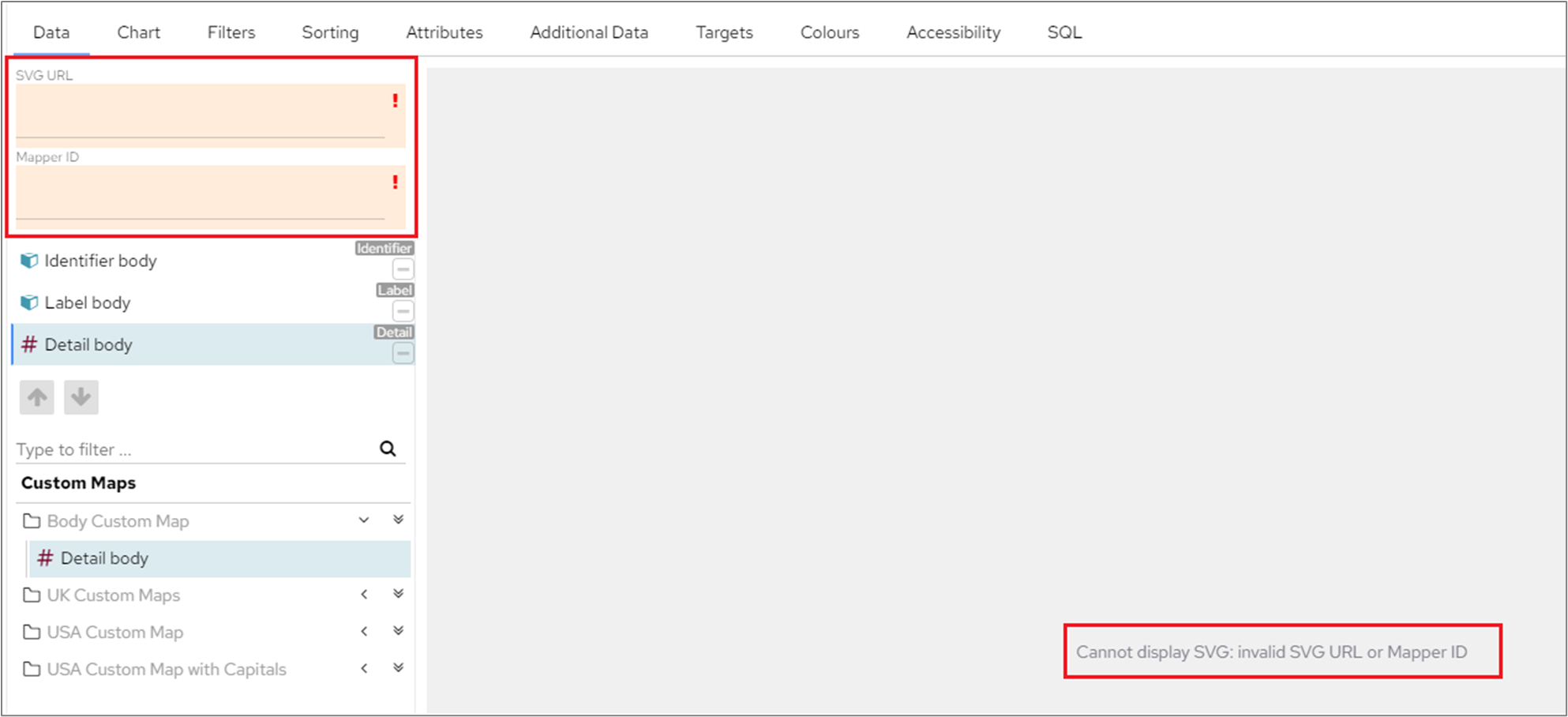
When creating custom maps, after adding data without filling in the SVG URL and ID fields, an error message will display in the chart editor to warn that these fields have not been completed.
When data for custom maps contains a null value within the identifier column, the data point will be ignored and the map will still draw. Null values or identifiers which don’t exist on the SVG will simply be ignored.
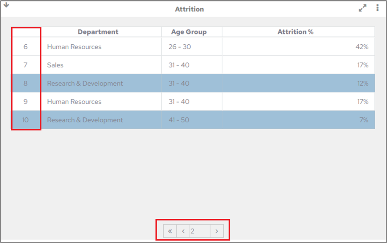
When using the pagination option to scroll through a table where ‘Row Numbers’ has been selected on the Attributes tab each page will show the correct row numbers. In the following example, pagination has been set at 5 records per page, page 1 will show rows 1-5, page 2 will show 6-10 and so on.
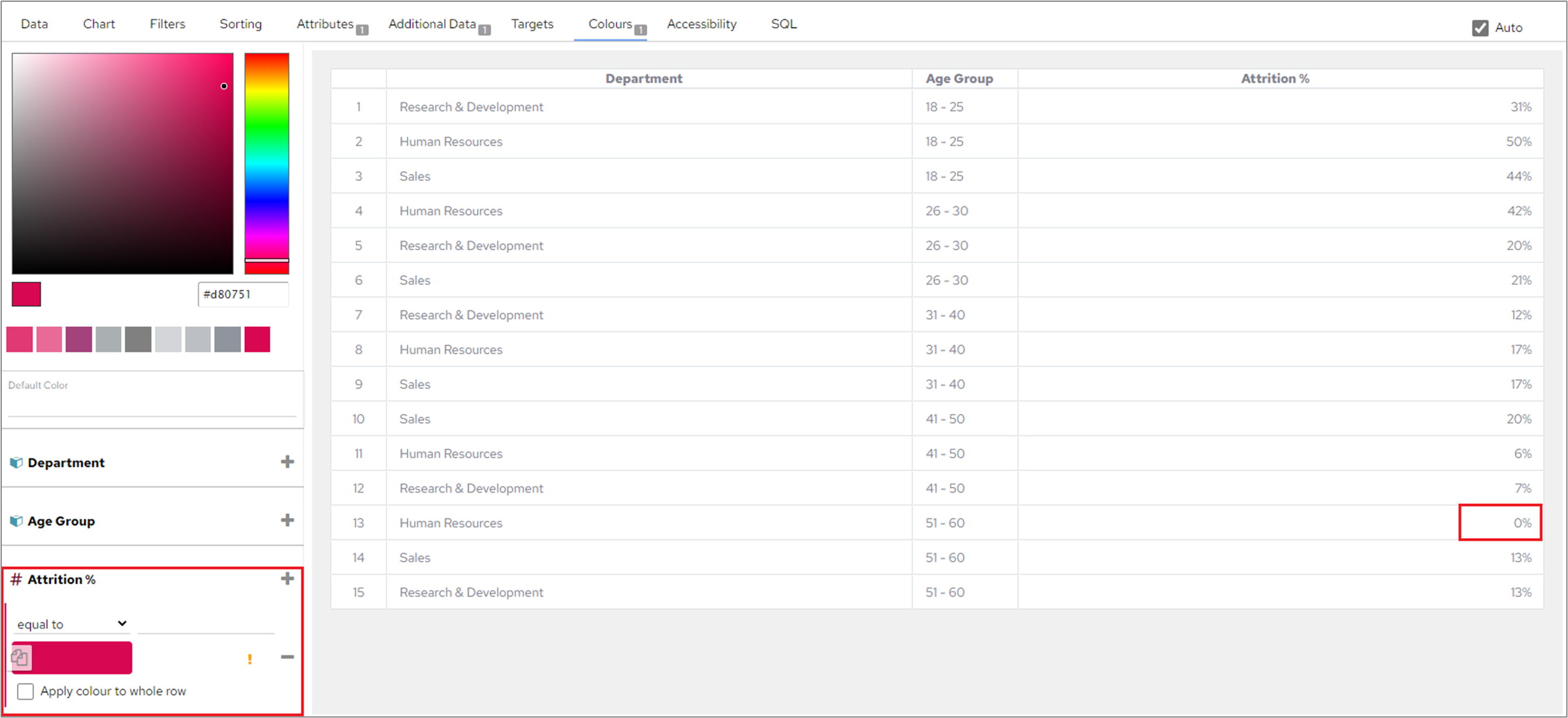
Previously table colour definition with blank values were being applied to data with values of zero. This has now been corrected so that the definition applies colours to empty values.
Tables were losing the scroll position when users clicked on a specific row in full screen mode. A change has been made that will ensure that the scroll position will remain at the same level as the selected row instead of resetting to the top of the table.
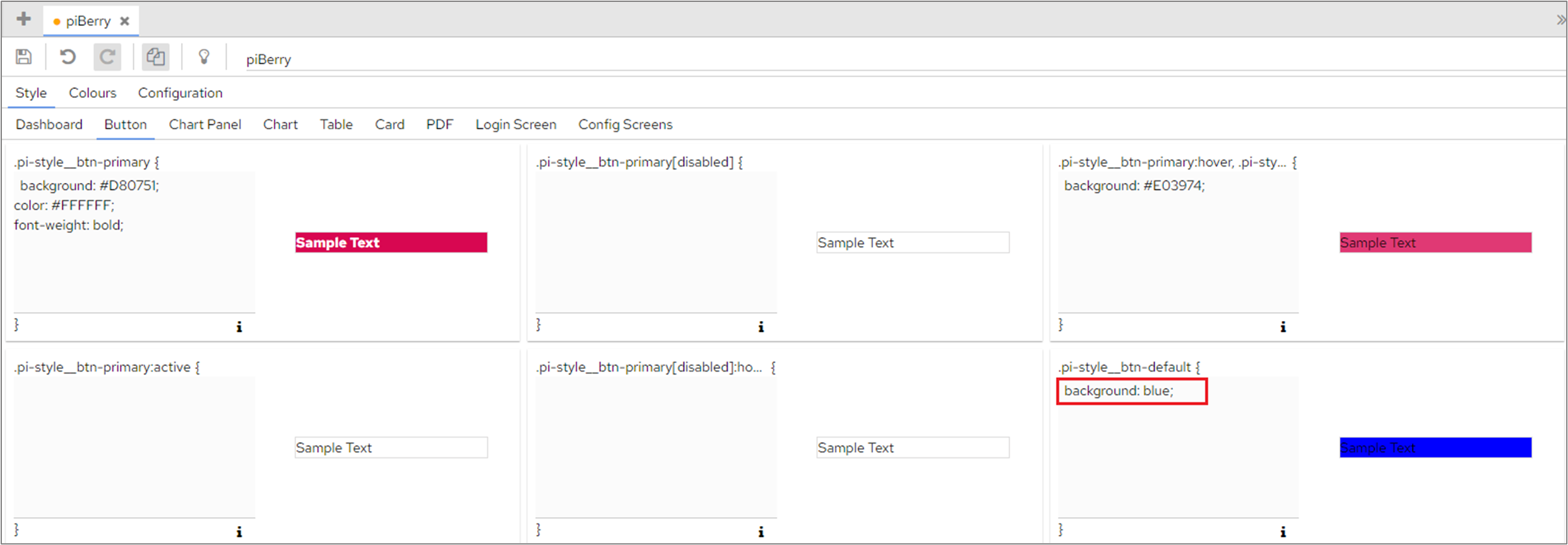
In Dashboard Configuration>Themes>Style, when setting a colour for a button e.g. .pi-style__btn-default users had to enter ‘color: blue !important;’. !important no longer needs to be added and users can simply enter the colour as color: blue;.
Images inside table cells were not being rendered properly when the dashboard was first loaded. A change has been made to the system that will ensure that images inside table cells will now render correctly.
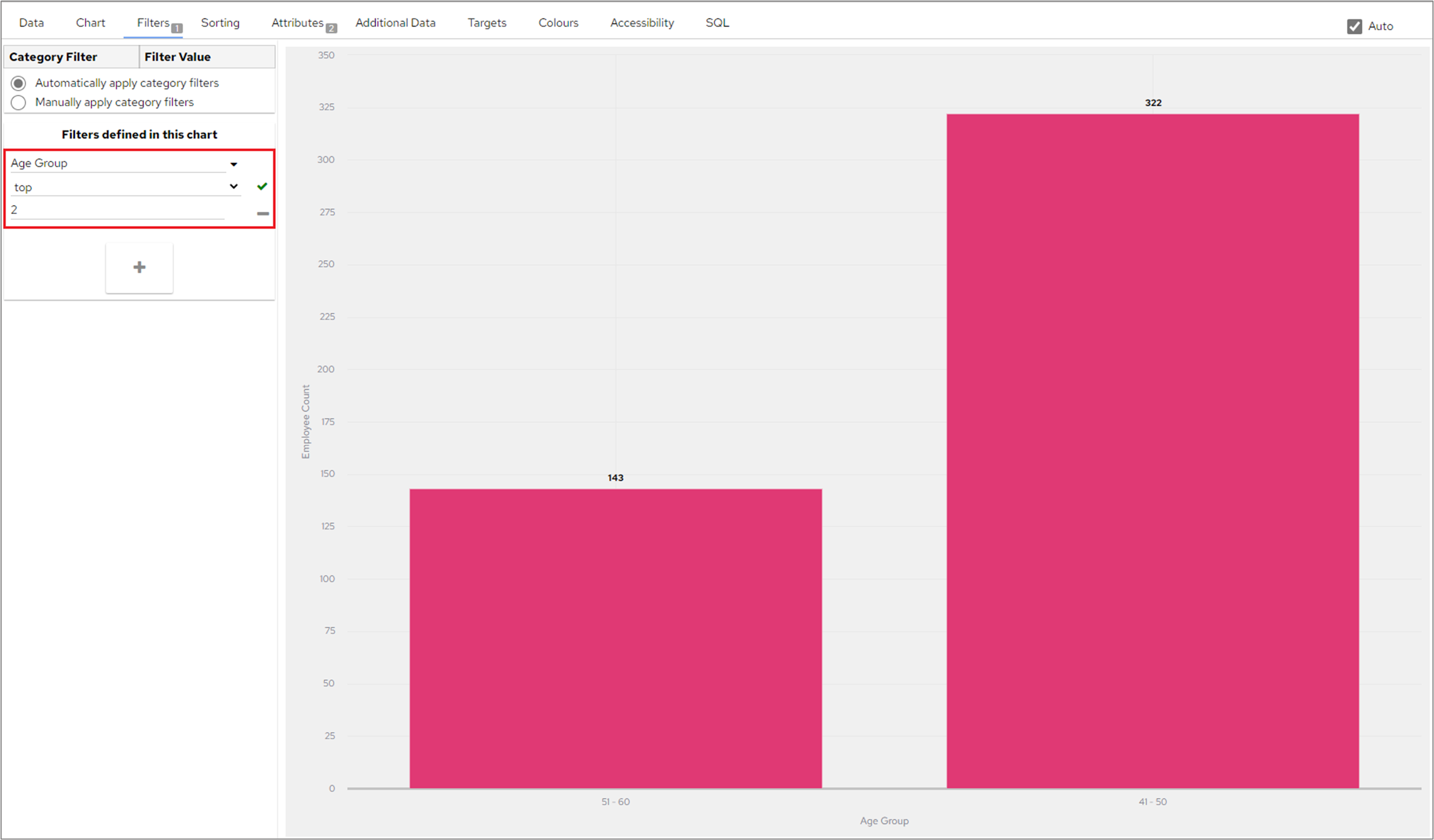
When a top or bottom filter was applied to the X axis of a single dimensional chart, the filter was being ignored. A change has been made to ensure that data will now be filtered correctly based on the filter.
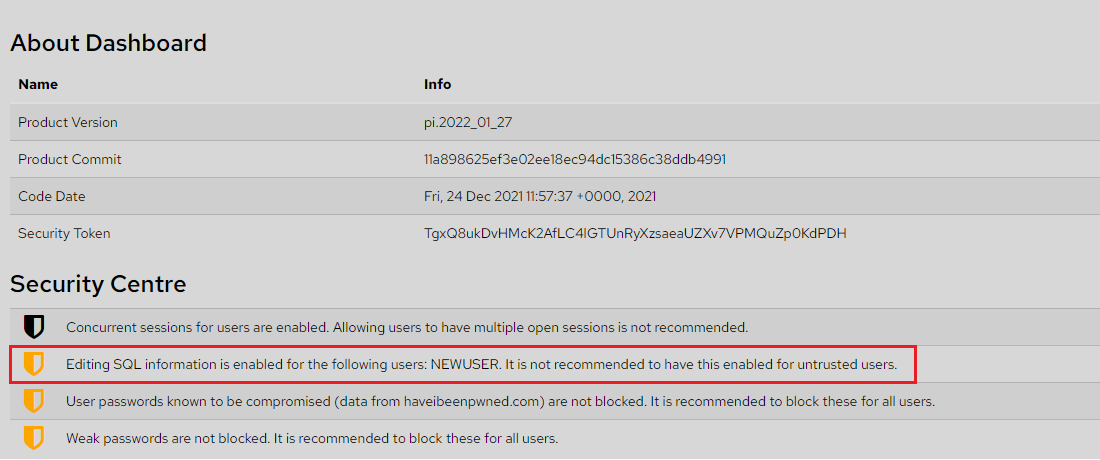
When an Admin user clicks More Options>About (top-right hand corner of the dashboard) they will only see a list of users and roles, in Security Centre, who have the ‘Can Edit Chart SQL’ privilege when those users are managed by the logged in user.
When exporting a connection that contained a chart that had colours in a corrupted state the colours were also exported, which caused the import of the connection to fail. A change has been made that will prevent broken colours from being exported.
When a data table containing the ‘&' symbol in a field was exported to Excel, Word or PowerPoint the symbol was converted to %amp; in the text. A change has been introduced and the '&' symbol now remains unchanged when the table is exported.
When editing categories on a dashboard containing multiple data connections and changing a category object to Single Date Picker or Date Range it was taking a time to figure out the correct database date/ time format. A change has been introduced that will prevent this time delay from happening.
Updated how the system handles user and user permissions when multiple requests are attempting to access the system at the same time.
When setting up the Elasticsearch data connection, it was previously not possible to use the data in the connection unless you manually changed the table name to not include the schema name. A change has been made to ensure that the table name is automatically being amended once the connection is set and the data table is being created.
When there were multiple parent charts on the screen with one of them being a multi-dimensional chart, the multi-dimensional chart had none of the data blocks highlighted when using the other parent charts to filter the data. A change has been introduced that will ensure highlights are visible on all related charts.
When editing a report, links couldn’t be inserted into a blank box or any new line of a text box. A change has been added to address this issue.
When editing a report with more than 3 pages 3 pages were displayed for editing, which was causing scrolling issues. Now only the one page being edited is displayed.
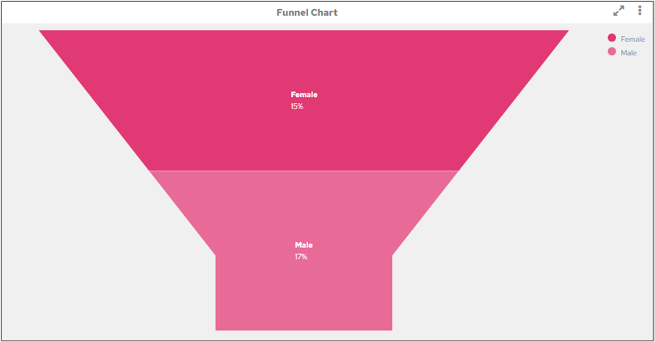
When ‘Show Data Values’ has been selected for Funnel & Pyramid charts, the data labels will now be displayed on the inside of the chart so that they are not cut off in certain screen resolutions.
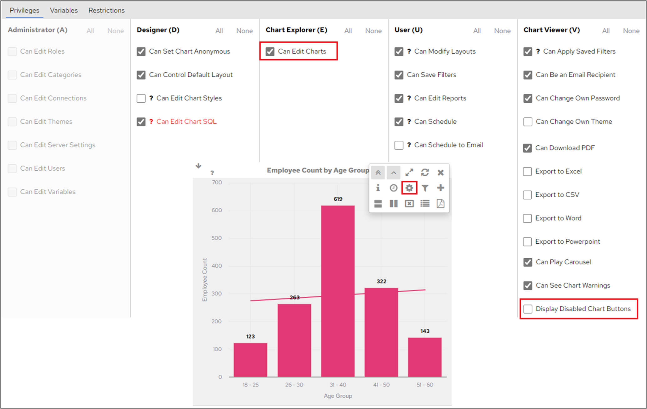
When setting up a new user that had ‘Can Edit Chart’ privilege, they were unable to edit charts when the ‘Display Disabled Chart Button’ was unticked. A change has been applied that means that users will now be able to edit charts, when they have the relevant privilege, even if the ‘Display Disabled Chart Button’ is unticked.
Active buttons in the system were previously displayed as blue. They will now be displayed in the colour defined by the theme.
A change has been made to Chart Editor to prevent mini scroll bars appearing when changing zoom sizing in chrome v96.
When a Stacked Bar chart had the ‘Show Total Value’ attribute applied, the total value were not being displayed when this chart was put into a merged chart. Now, the merged chart will show the total values if one of the charts being merged has the ‘Show Total Value’ attribute set in the chart editor.
| Info |
|---|
Total values will not be displayed in a merged chart if the child charts do not have this attribute specified. |
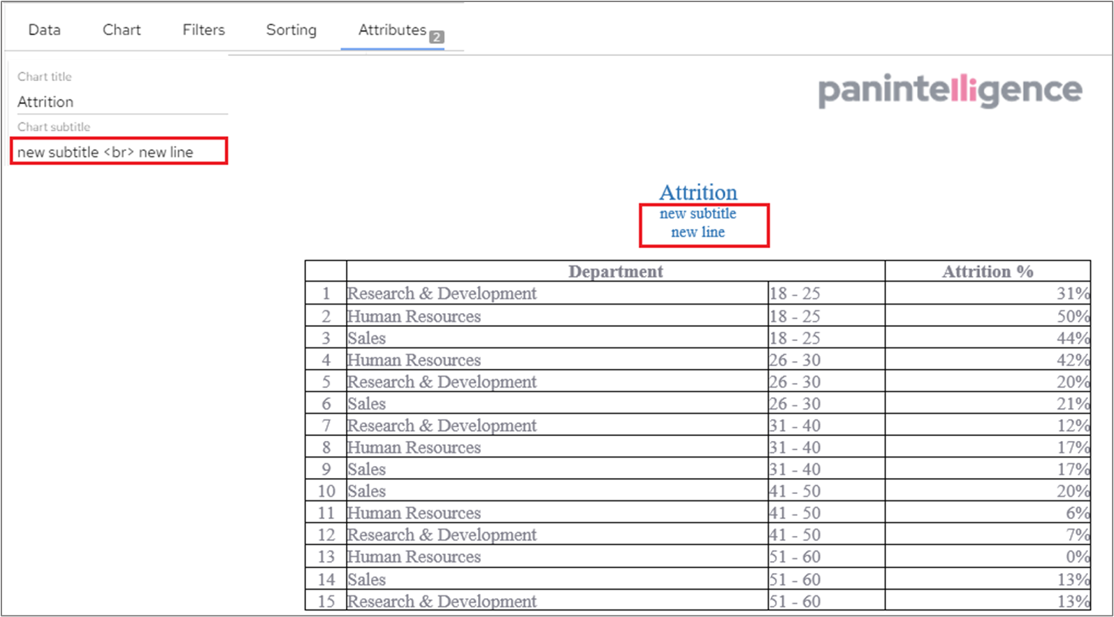
Chart subtitles would not appear on a new line when a chart was exported to Word - they were concatenated with the chart title and were all appearing on the same line. Now, if a subtitle is added, it will appear beneath the chart title and in a smaller font when exported to Word.
| Info |
|---|
<br> can also be used in the subtitle field to force text onto a new line. |
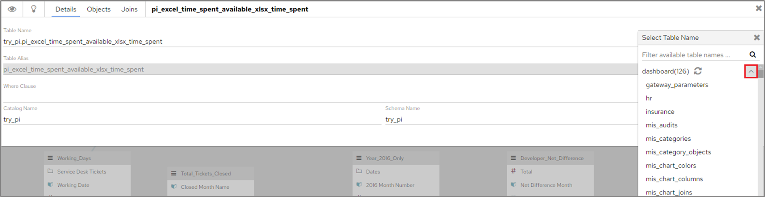
The expand option on the ‘Table Name’ field in Data Connections will now show a list of all available tables that users can select from.
If a default colour is defined on a Map chart type that does not contain a legend, this colour will override the original colour in which the chart was drawn.
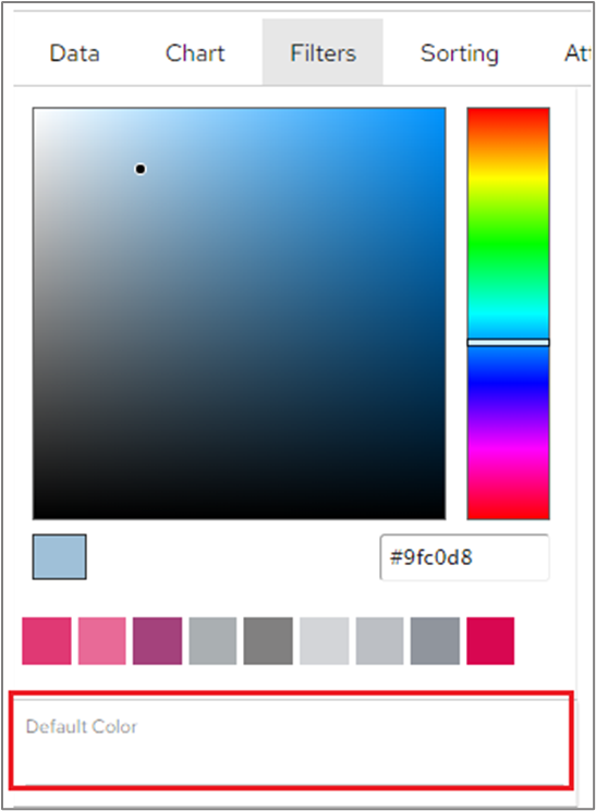
This also applies to Scatter and Bubble Chart Types that do not have a legend.
When a user tried to log in with an invalid licence (XML or UUID), the dashboard would return an ‘unexpected error’ message. This has been changed to be more descriptive, so users are aware of the specific issue. An invalid licence will now return an error message of ‘licence key is invalid or not found’.
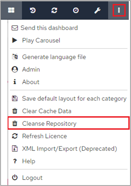
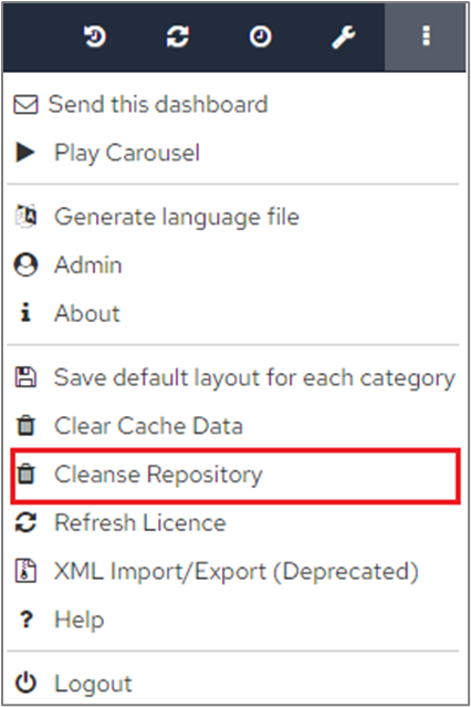
The message that is displayed when users click ‘Cleanse Repository’ under ‘More Options’ has been amended to ‘Successfully cleaned data repository’.
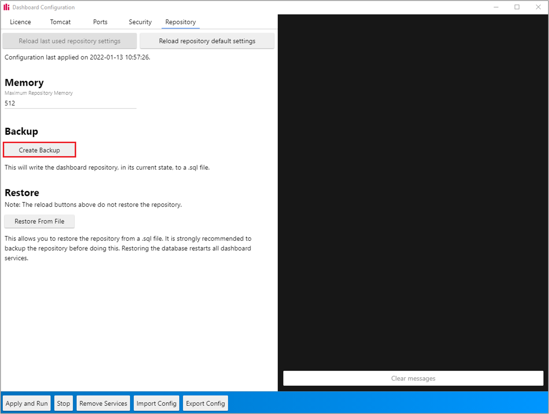
When a backup was created using the Configuration Tool GUI, the backup was created correctly but an error was displayed in the console. In this release, the backup will be created without any errors being produced in the Configuration Tool log.
When importing a data connection, all the categories created should be assigned to the admin that does the import. Previously this wasn’t happening and the admin user didn’t have access to the new imported categories.
Previously, when importing a data connection, new objects were created successfully but any objects being imported that had the same display names as objects that already existed in the target system were not being updated correctly. Imported objects that already exist in the target system will now be updated correctly.
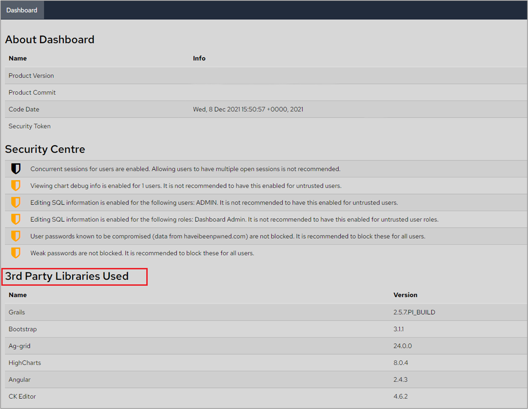
The ‘About’ page, under ‘More Options’ at the top-right of the dashboard, has now been updated to show the up to date 3rd party libraries (and their version numbers) used in the dashboard.
Role Variables and Role Restrictions are now deleted when deleting a Role. Previously, these remained in the database when a role was deleted.
An Admin user can click ‘Cleanse repository’ under ‘More Options’ to remove bad data.
Tables with values that contained line breaks within them would fail to successfully export to Word, Excel and PowerPoint. This has now been resolved and the exported table values will be formatted in the same way that they are stored in the database.
Frame ancestors settings were not being applied to the dashboard in the old API if set up in the configuration tool. If you set trusted hosts or any other frame ancestors settings in the config tool GUI these will now be applied to the dashboard and reflected in web.xml file at the following path; DASHBOARD_DIR/webapps/panMISDashboardWebServices/WEB-INF/web.xml.
Conditions that are defined to compare measures will now be reflected correctly in the dynamic drill path logic. Previously, when a condition was defined to compare with a measure value it was showing a ‘Drill condition is not defined’ message when the condition was actually satisfied.
If a report was created before the new text editing feature was introduced, October 2021 release, break lines in the text content appeared to be one line in the new text editor design view. The design view will now show identical content to the report that will be sent out.
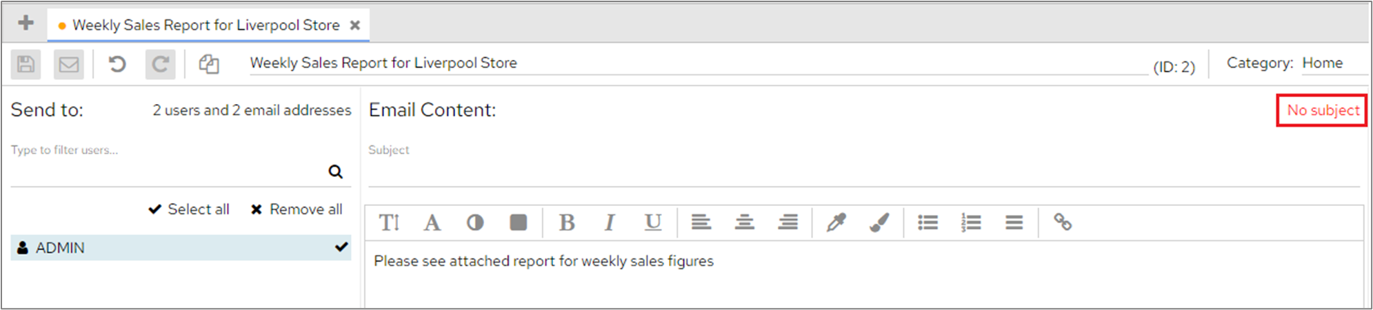
When a user edits a message on the Schedule screen, the error message relating to the missing information will be updated correctly.
In the following example, the email subject has been deleted and the error message confirms the missing subject field.
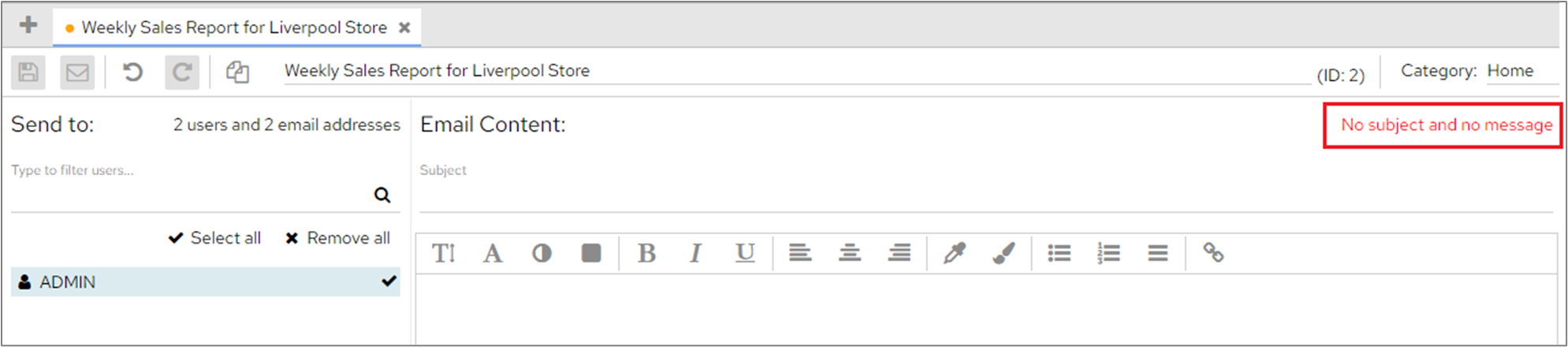
In this example, the subject and message have both been removed and again the message confirms both pieces of information are missing.
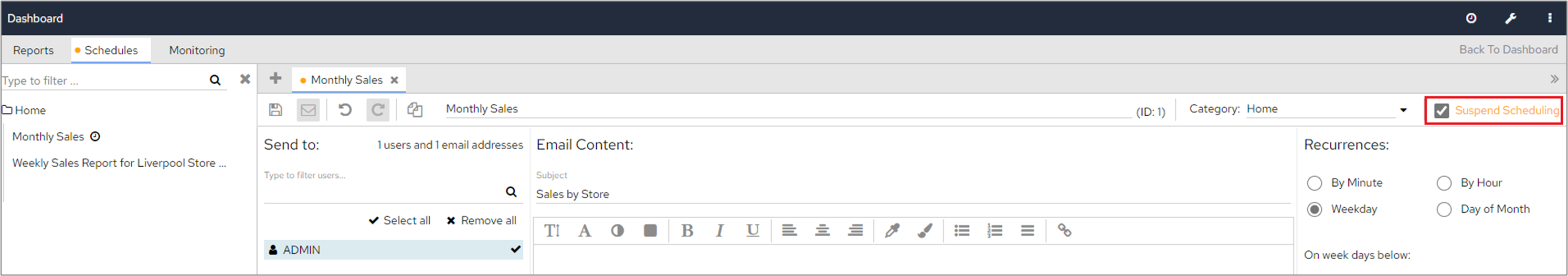
When a schedule is set to suspended, any active jobs related to that schedule will also be cancelled.
Added database indexing to resolve system slowness when there are too many historical login records.
The renderer service was not working when upgrading from November to the January version. Changes has been made to how the Tomcat server.xml file is regenerated to include the internal port connector which was reintroduced in the January release.
All the files in tomcat/conf folder will be overwritten when upgrading to ensure the latest changes to the config tool are applied.
| Info |
|---|
Please note that custom modifications in the files in tomcat/conf folder will not be preserved on upgrades but can be applied again afterwards. |
With a SQL Server instance supporting Windows Authentication use the appropriate options in the Dashboard Datasource connection screen to configure a matching connection. The connection will not work and you get the error ‘This driver is not configured for integrated authentication’.
The repository service was not starting when the Dashboard was installed into the root of a drive (or any folder with no space).
Error messaging has been improved in the scheduler when a chart is sent to a user who has no access to the category. The validation of the user permissions occurs only after the schedule has been scheduled and the user will receive an error message in the monitoring screen warning that there may be at least one user without access to a chart and advising to check users' access rules and role permissions.
The scheduler service was breaking if the app port has been changed in the configuration tool after the initial installation. The scheduler will now work with no issues if any changes happen in the configuration tool as the ports will be updated once the changes are applied.
Keeping An Eye On pi
| Info |
|---|
|


