With effect from the 2022-03-31 dashboard release:
We have added a new chart type called ‘Power Ring’.
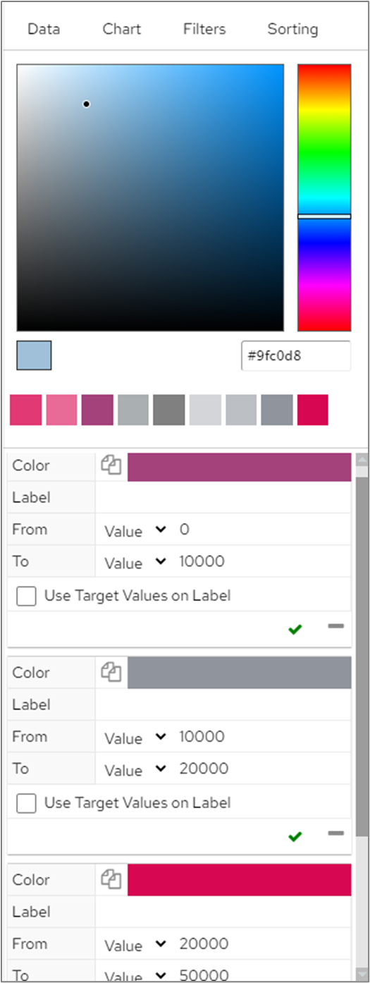
The Power Ring chart type works in a similar way to a Speedometer. A ring is displayed which corresponds to the total height of all targets that have been added on the Attributes screen in Chart Editor.
The colour displayed on the ring is taken from the target that the data point you’re hovering over is within.
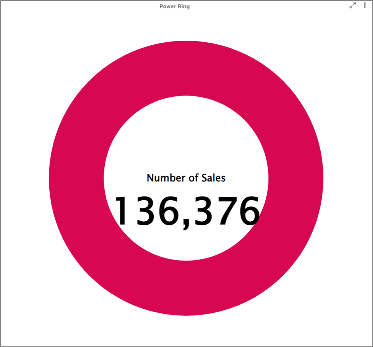
In the following example, we’ve added 3 targets for our Measure of ‘Number of Sales’
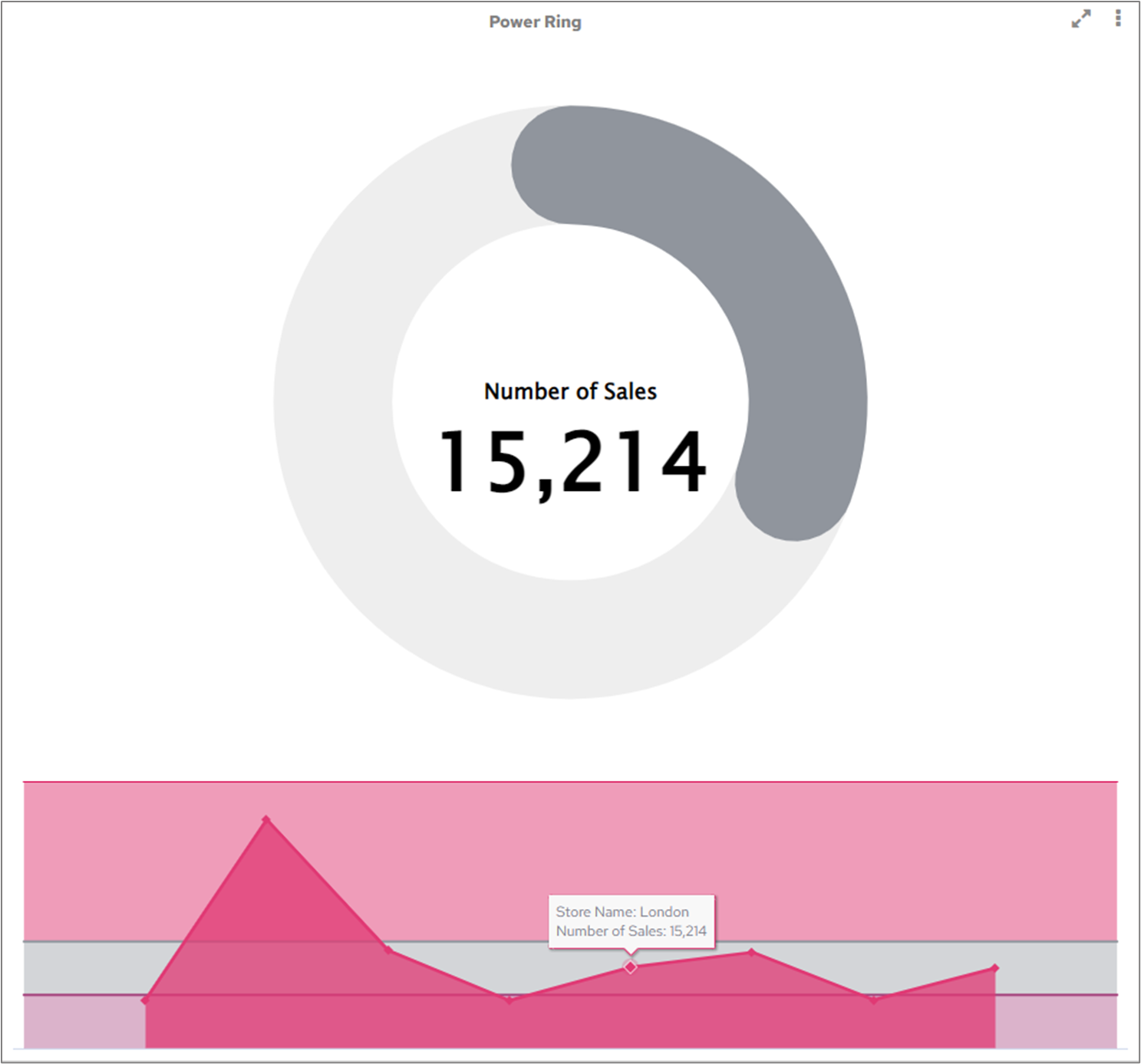
When using the chart on the dashboard, we hovered over the number of Sales for the London store, which falls within the 10000-20000 grey coloured target. The colour of the ring reflects this colour.
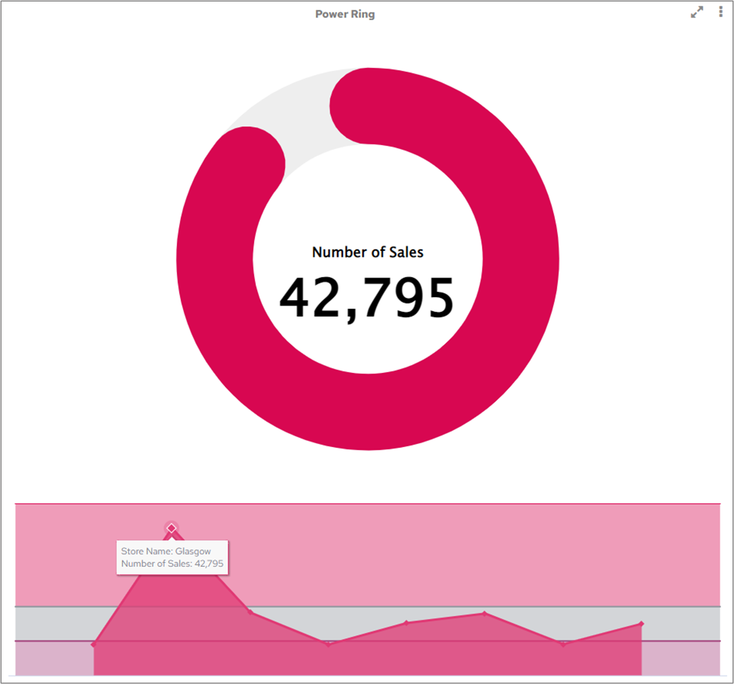
When hovering over Sales for the Glasgow store, the colour of the ring is updated to show the red 20000-50000 target.
Currently, Power Ring supports one single dimension (Sparkline) and one series (Measure). If you only want to display the total value of the Measure, you can remove the dimension from the Sparkline field.